


Themes-Wallpaper&Icons&Widgets
3.6261.00 Reviews
App Specs
- Version
- 2.10.0
- Updated On
- License
- Free
- Downloads
- 1,000,000+
- Developer
- Innova Tool
- Categories
- Personalization
- Platform
- Android
Screenshots
 Analysis by AppCompare
Changing a phone’s appearance usually sounds easier than it feels. A wallpaper is simple enough, but creating a consistent look across icons, widgets, and the rest of the home screen can become a small design project. Themes-Wallpaper&Icons&Widgets, a free personalization app from Innova Tool, is built around making that process feel more connected. I found its main appeal in the way it treats the screen as one visual space instead of a collection of unrelated pieces.
The app is available for everyone and works on Android 7.0 or later. It has passed the one-million-install mark and holds a 3.6 average from around 2.4 thousand ratings, so it is clearly being used by a sizeable group of Android owners, although the rating also suggests that the experience will not suit every phone or every user. The current release is version 2.10.0, and the basic download is free, with optional purchases ranging from $1.99 to $39.99 per item.
One visual idea for the whole home screen
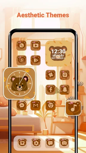
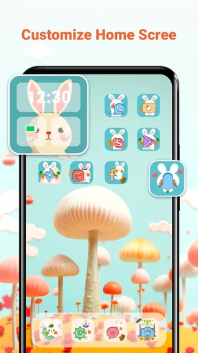
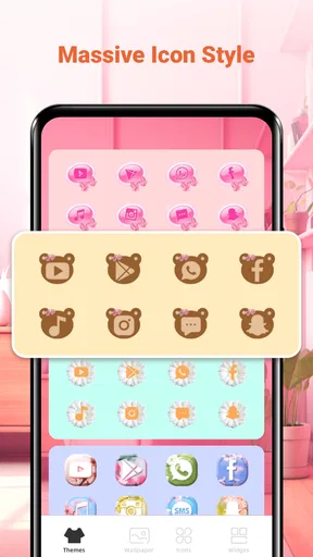
The capability I kept returning to is the app’s combined approach to themes, wallpapers, icons, and widgets. Many personalization tools concentrate on one layer: a wallpaper app gives you backgrounds, an icon pack changes app symbols, and a launcher handles the arrangement. This app puts those elements in the same personalization conversation, which is useful when the goal is not merely to find a pretty image but to make the phone feel deliberately styled.
That distinction matters in daily use. A wallpaper can look excellent on its own and still make icons hard to read. An icon set can be attractive but clash with the colors behind it. A widget may introduce a completely different visual language. By bringing these choices together, the app encourages me to judge the screen as a composition. The result is less about collecting individual decorations and more about finding a combination that remains comfortable whenever I unlock the phone.
I would not describe this as a replacement for every Android customization tool. It is better understood as a convenient starting point for people who want a coordinated appearance without manually searching through several separate apps. If you already have a carefully tuned launcher, a favorite icon system, and a large personal wallpaper library, its main benefit may be less important. For someone starting with a plain home screen, however, the combined concept is immediately more useful than browsing wallpapers alone.
Why the combined approach changes the result
The most noticeable effect is consistency. When the background, shortcuts, and information panels belong to the same visual direction, the screen feels calmer. That does not necessarily mean minimal or dark; it simply means the elements appear to belong together. I found this especially helpful when I wanted a more focused home screen rather than one that looked like a default layout with a new background pasted behind it.
There is also a practical advantage. A coordinated theme can make it easier to decide what to remove. Once the screen has a clear visual identity, random shortcuts and mismatched widgets stand out. That can lead to a cleaner arrangement, which is a useful side effect for anyone who wants faster access to a few important apps rather than a crowded first page.
Worth Reading Before You Choose

EA SPORTS FC Mobile 26 Is a Bigger Football Game, but It Takes Time
Flipboard Shows What News Apps Must Do Beyond the Feed

Switching to Android Auto Means Rethinking Your Driving Routine
Google Calendar Makes a Crowded Week Easier to Manage
Ludo King Makes the Most of the Minutes Between Plans

Baby Panda World Brings Quick Play to Modern Phones, but Its Game Library Feels Busy
Still, visual coordination should not be confused with deeper phone customization. The app’s purpose is presentation, not a complete redesign of Android’s behavior. If your priority is changing gestures, replacing the launcher, building automated layouts, or controlling every spacing detail, a dedicated launcher will probably give you more control. This app makes the first layer of personalization easier, but it should not be judged as a full system-management tool.
How I used it in practice
I approached the app as I would when helping a friend refresh an ordinary phone: first decide what mood the screen should have, then make the background and supporting elements agree with it. That order is important. Starting with icons can lead to a set that looks good in isolation but leaves you searching for a suitable background afterward. Starting with the overall theme gives the rest of the screen a clearer direction.
My practical advice is to choose the home screen’s job before choosing its decoration. If the phone is mainly used for messaging, calendar checks, music, and navigation, readability should come before visual drama. If it is mostly a personal device used for photos, social apps, and browsing, you can afford to make the layout more expressive. The same theme can feel successful or frustrating depending on whether it supports the way you actually use the phone.
After selecting a visual direction, I would keep the first page restrained. A wallpaper needs open areas behind icons, while a widget needs enough space to remain legible. Filling every available position can hide the design and make the screen harder to scan. I prefer placing only the apps I reach for repeatedly on the first page and moving less frequent shortcuts elsewhere. This is not a special button or hidden mode; it is a workflow choice that makes the app’s coordinated styling more effective.
Making icons work with a busy wallpaper
One of the less obvious trade-offs is that an attractive wallpaper may be a poor functional background. Detailed images can compete with icon labels, especially when the important part of the picture sits beneath the shortcuts. I found that the best-looking arrangement is often not the most dramatic one. A quieter central area can improve recognition more than an impressive image with strong contrast everywhere.
If a chosen background feels too busy, I would first try changing the icon placement rather than abandoning the theme immediately. Moving shortcuts away from the most detailed area can restore clarity. Reducing the number of icons on the first page also helps. This is a small adjustment, but it is exactly the sort of practical decision that separates a pleasant home screen from one that looks good in a preview and becomes tiring after a week.
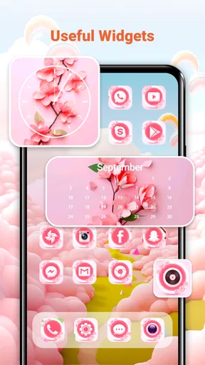
Widgets require similar care. Their value is not just decorative: they should save a step by showing information or offering a useful entry point. A widget that matches the theme but takes up valuable space without improving your routine is not a good exchange. I would only keep one on the main page if I regularly use what it displays. Otherwise, the visual unity is not worth the lost room for essential shortcuts.
A realistic everyday setup
Imagine someone who checks a calendar before leaving home, sends messages during the day, listens to music while commuting, and uses maps when meeting friends. With this app, I would create a theme that keeps text and icons easy to distinguish, place the calendar or another genuinely useful widget where it can be seen quickly, and reserve the remaining space for the few apps used most often. The point is not to make the phone look like a showroom example; it is to remove small moments of friction from repeated actions.
In that situation, a coordinated screen can make the device feel more personal without making it slower to use. The wallpaper supplies the mood, the icons make the main shortcuts visually consistent, and the widget earns its space by answering a recurring need. If the user later notices that the screen is still crowded, the solution is to simplify the layout rather than add another decorative element.
This approach also works well for a phone shared with a particular routine, such as a device used mainly for study, travel, or photography. A theme can reinforce that purpose and make the relevant tools easier to identify. The limitation is that the app cannot decide which apps matter to you. The useful result comes from combining its visual material with a little discipline about placement.
Where the free app fits, and where it does not
The free entry point makes experimentation straightforward. I can explore the personalization concept without committing money before knowing whether a coordinated screen is worth maintaining. That is important because themes are subjective: a style that looks appealing in a preview may not remain comfortable once labels, notifications, and daily shortcuts are involved.
At the same time, optional purchases are part of the experience, with individual items priced from $1.99 to $39.99. That is a wide range, so I would approach premium choices carefully rather than assuming every attractive option is necessary. A sensible workflow is to live with a free arrangement first, identify what is genuinely missing, and only then consider paying for a specific item. Buying several decorative elements before testing the basic layout can turn a simple refresh into an unnecessary expense.
The app’s 3.6 average is another reason to keep expectations measured. It is not a warning that the concept is unusable, but it does suggest that compatibility, visual taste, and personal expectations vary. Android phones differ in screen proportions, launcher behavior, icon handling, and widget presentation. A theme that feels balanced on one device may need adjustment on another. I would treat the app as a flexible styling aid rather than expecting a perfect one-tap transformation on every handset.
Compared with using separate wallpaper, icon, and widget apps, the advantage here is convenience and a more unified starting point. Separate tools can offer deeper specialization, and a dedicated launcher may provide more control over grids, gestures, folders, and transitions. The trade-off is that a multi-purpose personalization app may not satisfy users who want to fine-tune every technical detail. I would choose this app for a coherent visual refresh, not for building an entirely custom Android interface.
Who should be cautious
I would be cautious about recommending it to someone who dislikes changing their home screen once it works. Personalization apps are most valuable when you enjoy experimenting, comparing styles, and adjusting the arrangement. If you want a stable, highly functional setup with no decorative extras, the standard launcher and a carefully selected wallpaper may be enough.
It may also be a weaker fit for users who already own a large collection of trusted icon packs and widgets. In that case, the app’s convenience is less compelling because the hard work of assembling a visual system has already been done elsewhere. A launcher-focused solution may be better when precise layout control matters more than browsing coordinated visual options.
On the other hand, beginners can gain a lot from the guided idea of styling several screen elements together. Instead of wondering why a new wallpaper makes the phone look unfinished, they can think in terms of contrast, spacing, and visual consistency. Those lessons remain useful even if they eventually move to another personalization tool.
Who gains the most from this approach
In my view, the strongest audience is Android users who want their phone to feel less generic but do not want to spend an evening assembling a design from unrelated sources. The app gives that person a practical starting point: choose a direction, coordinate the major visual pieces, and then edit the home screen around real habits.
It is also a good option for someone refreshing an older-looking setup. Because it supports Android 7.0 and later, it can be relevant to people who are not using the newest device. That broader compatibility makes the idea more accessible, although the final appearance will still depend on the phone’s own launcher and screen layout.
I especially like it for users who think in moods rather than technical specifications. Someone may want a calmer screen, a brighter look, or a more organized visual identity without knowing anything about icon formats or launcher settings. The app’s value is that it turns those broad preferences into a set of coordinated choices. The user still needs to make sensible decisions, but the starting point is easier to understand.
People who care about accessibility should judge each arrangement by readability rather than appearance alone. High contrast between icons, labels, widgets, and the background matters more than matching everything perfectly. A visually unified theme that makes text difficult to read is a poor result. I would test the screen in ordinary lighting, when the phone is being used quickly, instead of approving it only while browsing calmly through customization options.
Another useful habit is to take a moment before replacing a setup that already works. Ask whether the current problem is visual boredom, poor organization, or missing functionality. Themes-Wallpaper&Icons&Widgets can address the first issue and may help with the second, but it will not automatically solve every home-screen problem. If the real frustration is finding apps, a better folder structure or launcher may produce a larger improvement than a new theme.
My final view after using the concept
The best thing about Themes-Wallpaper&Icons&Widgets is its focus on the relationship between the main parts of the home screen. Instead of treating a wallpaper as the whole makeover, it invites you to consider how icons and widgets support the same visual idea. That makes it more useful than a basic background browser for anyone who wants a screen that feels intentionally designed.
Its limitations are equally clear. The free format is appealing, but optional purchases can become expensive at the upper end, and the moderate average rating suggests that the experience will not be equally satisfying for everyone. It is not the right tool for users seeking deep launcher controls, advanced automation, or a completely bespoke interface. Those users should look toward more specialized Android customization options.
For me, the deciding question is simple: do you want a coordinated refresh, or do you want to engineer every part of the phone’s behavior? If the answer is a coordinated refresh, this app is worth trying at no initial cost. I would begin with one restrained theme, keep only useful widgets, check icon readability in everyday use, and avoid paying for extras until the basic arrangement proves comfortable. Used that way, Themes-Wallpaper&Icons&Widgets can turn an ordinary Android home screen into a more personal and coherent space without demanding advanced customization knowledge.
My recommendation is therefore positive but measured. It is a practical choice for visual experimentation and a particularly sensible starting point for people who have never combined wallpapers, icons, and widgets before. Just remember that the strongest result comes from editing your habits and layout along with the artwork. The app supplies the direction; your choices determine whether the finished screen is genuinely better to live with.
Pros
- Large collection of wallpapers
- icons
- widgets
- and matching themes
- Regular content updates keep the customization options feeling fresh
- Preview tools make it easy to test a look before applying it
- Supports creating a more consistent style across the home screen
- Simple browsing categories help users find designs quickly
Cons
- Some premium themes and customization packs require payment
- Certain widgets may use extra battery or system resources
- Compatibility can vary between Android launchers and device models
- Ads may interrupt browsing for users on the free version
- Applying icon packs may require additional launcher configuration
FAQs for Themes-Wallpaper&Icons&Widgets
What is Themes-Wallpaper&Icons&Widgets used for?
Themes-Wallpaper&Icons&Widgets is a customization app designed to change the appearance of your mobile device. It typically provides wallpaper collections, icon packs, widgets, and themed layouts that can give your home screen a more coordinated style. After installing it, users can browse available designs, preview how they look, and apply individual elements or complete theme combinations depending on device compatibility.
Is Themes-Wallpaper&Icons&Widgets compatible with every Android or iPhone device?
Compatibility may vary depending on your operating system, device model, launcher, and software version. Wallpapers usually work on most phones, while custom icons, widgets, and complete themes may require a supported launcher or specific system features. Before downloading, check the app-store requirements and read recent user reviews, especially if you use an older device or an iPhone with limited home-screen customization.
Does Themes-Wallpaper&Icons&Widgets cost money to use?
The app may offer a mixture of free and premium content. Basic wallpapers or selected customization tools can often be used without payment, while exclusive designs, complete theme collections, advanced widgets, or an ad-free experience may require an in-app purchase or subscription. Review the pricing details shown in the official store before confirming any trial, recurring payment, or premium download.
Will the app slow down my phone or use a lot of battery?
Static wallpapers and simple icon changes generally have little effect on performance, but animated wallpapers, frequently updating widgets, and background services can consume additional battery, memory, or mobile data. During testing, the impact will depend on your device and the features you enable. If your phone feels slower, reduce live effects, remove unnecessary widgets, and prevent the app from running continuously in the background.
Is Themes-Wallpaper&Icons&Widgets safe to install and use?
Download the application only from a trusted official store and verify the developer name, ratings, update history, and requested permissions. A customization app should not normally need access to sensitive information such as contacts, messages, or precise location. Avoid granting unnecessary permissions, review its privacy policy, and be cautious with third-party theme files or links that request personal details or redirect you outside the official app store.


